September 16, 2011
Using Data to Tell Stories About Poverty: A Cautionary Tale
On Tuesday, the Census Bureau released2010 income and poverty data. I spent a good chunk of the last few days reviewing dozens of news stories that covered the release, seeking answers to these questions:
What ispoverty?
What are its causes?
How can we solve it?
These are questions that all communications answer, one way or another. The challenge is to answer them deliberately. This is hard to do when data arethe story, because uninterpreted facts and figures allow the audience to answer those questions for themselves. And, you can be sure, most people will come to very different conclusions from those issue experts would desire or even expect. Further, because it’s easy for the media to focus exclusively on an alarming or surprising rate, trend, or ranking, data releases such as this are often huge missed opportunities to intentionally answer those key questions and educate the public about social problems.
What story was told, and to what effect?
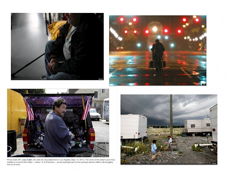
In the bulk of stories I read, poverty rates were reported for region, race, and age, and comparisons were made with prior years by all these variables. Most of the stories used the language of people falling or slippinginto poverty, escaping or rising outof it, or living on the line. And where there were accompanying visuals (examples below), they were consistently images of individuals– in bread lines, unemployment lines, shelters, on the street, etc. Nowhere were there images of factories and mills closing, graphs of rent, food, clothing, health care cost trends.
My point is that the frames employed focused on individuals being in or out of poverty. Most stories didn’t even indicate how poverty is calculated, much less point to larger economic trends that could, at least in part, explain these rates. This is a problem because there is a host of evidence that the more we frame social problems through narratives about individuals, the harder it is for the public to attribute responsibility to systems and to see public solutions (see Shanto Iyengar's "Is Anyone Responsible?"). Some stories noted that the recession, the economic downturn, the country’s inability to create jobs, were factors, but those ideas weren’t further explained. It is a wonder the Pew Research Center recently found that a majority of Americans are opposed to increased spending on the needy (link)?
Telling better stories about poverty
At this point you may be thinking, “But journalists were writing off of the press release published by the Census Bureau, which is all facts and figures, so why should coverage be anything but facts and figures?” Yes, that’s true, and it isn’t the Census Bureau’s responsibility to do more than collect and report the facts. But journalists also relied on experts and advocates to make sense of the figures. I sought to find a story that went beyond reporting the data to explain what poverty is, why it has increased, and what we might do to reverse the trends. To date, I have found one, by Katie Wrightat Center for American Progress. Perhaps I'm a bad Googler, but I searched high and low. And this is an essay on the Center's website, not a new story, which is important to note. While several news articles included assertions from experts that the data indicate a need to preserve “safety nets,” Ms. Wright actually explains what that means, and why:
“The data should also remind policymakers that we should not pursue deficit reduction that exacerbates growing poverty and inequality. The only good news out of the new data is that programs such as Medicaid, Medicare, unemployment insurance, SNAP/food stamps, the earned income tax credit, and Social Security are working to prevent further poverty and hardship. With low-income households and children bearing the brunt of the recession, it would be unconscionable to ask them to bear the brunt of deficit reduction by slashing the programs that support them when they fall on hard times. Instead, millionaires, billionaires, and our most profitable corporations need to contribute their fair share.
Congress and the Joint Select Committee on Deficit Reduction should take bold action to put people back to work and protect the most vulnerable. The time to act is now.”
Kudos to Ms. Wright. She explains what these programs can do, points out the injustice in not asking those who can do todo, and ends with a specific call to action.
She used the opportunity afforded by the data release to tell a broader story about government’s role in the economy. This is far more effective than a call to “preserve safety nets.” In fact, she wisely never uses the term. I say wisely because it runs the risk of reinforcing the unfortunate but widely held opinion that government does too much for those who won’t do for themselves. This is a view of government that is a very real problemfor those who do progressive advocacy, but I don’t need to tell you that! We should all take lessons from Ms. Wright.
Finally, on the topic of connecting the dots, or failing to, I can’t help but share this little nugget. Two days after the Census figures were released, the Department of Labor’s Bureau of Labor Statistics released figures on the price of consumer goods. Guess what? The costs of food, clothing, rent – all up in the last year. Guess what else? I could not turn up a single article that related the price of consumer goods to the poverty figures (i.e., Does this news on inflation contribute to a more complete picture of family income? Should consumer prices inform how we think about solutions to poverty?) In an AP article, however, I found this gem of a causal story:
“Food prices are still rising. The Agriculture Department said Monday that unusually hot summer weather has damaged the corn harvest, which could raise prices for corn and ultimately most food products. That's because corn is used in everything from cereals to animal feed to sodas. It takes about six months for changes in corn prices to filter down to grocery store shelves.”
I finally learned something from all of these data – what these numbers really mean, andhow they got that way. We should do more to offer these kinds of explanations whenever we report data trends.
See also: