November 9, 2016
No more PIE!
Charts, that is. Blueberry? Keep at it.
I have been doing away with pie charts in client materials for some time. This morning, I stumbled on the most excellent explanation of why, from Cole Nussbaumer Knaflic in her most terrific new book, "Storytelling with Data." She's written quite a bit on this, and even given a talk called Death to Pie Charts. A woman after my own heart, for sure!
The main reason I find the pie chart an ineffective communication tool is that it takes too much cognitive work for people to assign a quantityto an area. I do understand that pie charts CAN be useful in giving a quick sense of "percent of a whole," so I'm not calling for their total eradication.
But many of my clients use them like this:
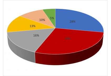
YIKES! Right? And doesn't the red 28% look bigger than the blue 28%? As Cole explains in her book, things closer tend to look bigger. AND, using 3D can make things even worse for a pie chart's interpretability. 3D charts throw in even more angles and dimensions for our eyes to sort through.
And don't go running out for donuts to solve this problem. Cole shows why the donut chart is similarly troubled. In short, Why ask your readers to interpret angles and areas when a simple horizontal bar chart would suffice?
Do purchase her book, but before it arrives, check out this blog post she wrote on Alternatives to Pie Charts. It's incredibly helpful, and I think you'll be convinced!
-lynn
See also: