August 3, 2016
How To Communicate About Income Inequality
While scrolling thru my FB feed one morning, I saw a link posted to this piece on Mother Jones, "It's the Inequality, Stupid. Eleven charts that explain what's wrong with America"
Here's the first chart posted, showing average family income by income group.
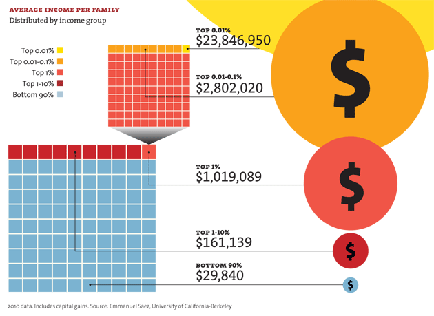
This chart communicates striking inequality in income, that's for sure. But it doesn't say why this is the case. When data are left uninterpreted, when communicators fail to tell a story, they leave it to the reader to deduce, "What does this MEAN?" And in that search for meaning, the reader relies on beliefs, values, and assumptions about how the world works to make sense of the data. Take the chart above as an example - you looked at it, and you probably scanned it or studied it in an attempt to answer, "What does this mean?" What values shaped your thinking? Fairness? Self-direction? Opportunity?
The impact of values on political thinking is not news, and has been well documented in a variety of disciplines (social and political psychology, developmental psychology, sociology, political science, communications). That's why it is a bit startling to see how frequently political communications fail to consider that sweet old news. Recently, Jonathan Haidt (see his recent book, The Righteous Mind and your morals.org for more) has offered a wealth of evidence that conservatives and liberals rely more or less heavily on some values than others to help shape their political impressions.
What does Haidt's work suggest about the values-based stories that liberals and conservatives are likely to rely on to explain these income inequality data? Conservatives, who strongly endorse values of self-reliance and individual liberty, are likely to look at these data and conclude, "Some people work harder, earn more, reap what they sow, and that's the way it should be. That is, in fact, fair." It is far easier to draw that conclusion when data are about inequality in outcomes, as opposed to inequality in opportunity. Liberals strongly endorse values of social justice, and are likely to look at these data and conclude that the system is rigged, that inequality of opportunity is the causeof inequality in outcomes. But the data don't necessarily tell that story. Not by a long shot.
But Jonathan Haidt has a recommendation for liberals on how to connect the dots:
If the Democrats really want to get moral psychology working for them, I suggest that they focus less on distributive fairness — which is about whether everyone got what they deserved — and more on procedural fairness—which is about whether honest, open and impartial procedures were used to decide who got what. If there’s a problem with the ultra-rich, it’s not that they have too much wealth, it’s that they bought laws that made it easy for them to gain and keep so much more wealth in recent decades. (http://campaignstops.blogs.nytimes.com/2012/02/20/how-to-get-the-rich-to-share-the-marbles/)
The data in the chart call into question distributive fairness, not procedural fairness. In his essay in this past Sunday's New York Times, The Blurry Line Between Makers and Takers, economist Tyler Cowen takes on the question of the role of politics in income distribution, and in so doing invites reflection on that question of procedural fairness:
Seven of the 10 most affluent counties in the nation are near Washington, D.C. That means a growing number of educated people are making a very good living advising, lobbying and otherwise influencing the federal government. This is a talent drain. It’s far from obvious that we are getting better policy as a result, and true wealth creation has not kept pace.
As Matthew Yglesias, a columnist for the online magazine Slate, has pointed out, there is also a subtler point about those wealthy Virginia and Maryland counties. They have high per capita incomes, not only because they attract educated, government-oriented professionals, but also because their zoning and building codes limit the supply of low-cost housing. That’s a significant government intervention that hurts lower-income people, who must pay more. Privilege-seeking through government is often most pernicious when it has a tidy front and a well-manicured green lawn.
Infographics are quite the rage. But infographics won't be effective no matter how clever the design if the data representation does not capture the real story advocates are trying to tell. Until we tell stories, such as Cowen's above, that paint a clearer picture of the causes of income inequality, we are not improving Americans understanding of this complex issue.
I'll be looking for examples of data-based messaging that succeeds on this front, and would love to hear from you if you come across effective examples.
See also: