March 30, 2017
Extreme Makeover – Data Version
Scrolling through my Twitter feed this morning, I came across this:
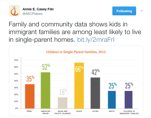
The way the data are displayed makes it unnecessarily difficult to draw the conclusion asserted in that post. There’s a lot going on here, with colors and other features of the chart competing for our attention. E.g.,
- What do the different colors mean? Is it significant that 2 columns are shades of grey and others are colors?
- My eye is immediately drawn to the smallest and tallest columns, which also happen to be near the center, and beside each other. Also, why is that value label (66%) IN the bar while the others are on top?
- Why does the Y-axis just go to 70%?
- Is the total column necessary info?
[If you like, you can read the Foundation’s blog post associated with this data]
I plopped the data into Excel and crafted this revision:
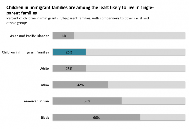
Full disclosure, I am a huge fan of the Annie E. Casey Foundation, and it is (easily) arguable that advocacy for child and family issues would not be what it is without their Kids Count data. But in this particular case, the design of the graph they created does not help make the point they wish to make.
*From a framing perspective, I also question why it was deemed valuable to share these data in this way. By calling attention to the low number of single-parent immigrant families (implicitly suggesting that’s a good thing), do these data inadvertently reinforce negative cultural stereotypes about single-parent families?
Do the data reinforce stereotypes about racial and ethnic groups also portrayed here?
Those are important questions to ask when presenting data. It’s also important to consider whether these kinds of data presentations, by triggering stereotypes, make the conversation we should be having more difficult to have. Namely, with over 1/3 of all US children living in single-parent families, how well are policies and programs responding to the reality of life for families today?
See also: